Tuesday 22 November 2011

Learning Activity 4: Cropping an image

In Halo, the Magnum is well known for it's rather "godly" power as an extremely powerful sidearm, here I brought more attention to the sidearm rather than the sci-fi soldier that's wielding it in the advert for the remake of a classic game by the name of "Halo CE"

Eliminating the Halo 3 ODST logo in the bottom right corner leaves the image with just the aerial battle between alien spaceships, and some "drop pods" that are hurtling down to the ground. It also frees up the picture from being "locked in" by the plant-like growth that hung off of the edge of the cliffs that were visible in the original image on the left and right.

Cropping the alien soldier here to display just it's helmet, and the weapons it held intensifies the feeling of the scene, dynamically altering it from just a lovely looking shot to a tense, almost western-like standoff where the characters grimace and stare tensely at each other. Added captioning and letter-boxing for increased effect.

Originally taking a landscape picture and then cropping it to fit a portrait layout is optimal in this photo as it prevents the waste of a lot of space - The background, trees, fence, ground, bushes, are all very non essential, and having too much of that washes out the character as the importance of the subject is lost to it's surroundings.

Sunday 13 November 2011

Lesson 8

Learning Activity 15:
Open this MS-Word document (42KB, Word 2003) and follow the instructions. It's a research assignment to develop your understanding of colour use and allow you to explore online resources that might help you in your study/ work.
Save it somewhere safe, then submit it for feedback via the Assessment Tool.

http://www.mediafire.com/?czsk1w047mccdlt

My apologies,  <insert picture> was supposed to replaced with the following image:


Lesson 7

Learning Activity 14: Short-answer research assignment
  1. What happens to the "searchability" and "accessability" of your web pages if you set your type using Photoshop or Flash?
  2. List all the standard html typefaces you can use in web publishing for mac and also for Windows PC.
  3. List all the things you can do to a typeface using html (hint: bold is one variation, there are 8 altogether)
  4. List all the things you can do to type using CSS (cascading style sheets).
  5. List free online 3 tools that can help you visualize how a typeface looks on a web page.
  6. What's aliased type? What's anti-aliased type?
  7. What's so good about the @font-face html tag?
http://www.mediafire.com/?2in0i6po7fhehny

Lesson 7

Learning Activity 13
Using MS Word or Photoshop, choose one of the following quotes and design a layout based on it. Size is A4 - landscape or portrait. Just type only - no illustrations. Use any typeface families and any colours.


"Worry often gives a small thing a big shadow" Swedish Proverb.

Lesson 7

Learning Activity 12: Good and bad type (2-3 hrs)
This assignment requires you to grab a digital camera and find 5 examples of what you feel is representative of good type use in logos, signage, print layouts, graffiti, car graphics, t-shirts etc. and 5 examples of what you feel is bad typeface use

I'll start off with the bad typeface usage - In the first example you can instantly tell that the font used for the title, "Junior Jazz Dance Classes", is unfitting for an event that covers Cheerleading, Hip Hop and Jazz. Additionally, the two dancing figures are quite... Suggestive to the point where if one blurs his vision slightly, the two dancing figurines looks like something completely different...


In the next example shows the abuse of Comic Sans - It clashes with the Wendy's font, and looks more or less photoshopped on by someone rather than being an actual part of the poster:

Here we have the overuse of cliched graphics for letters - Unfortunately the computer-mouse for the letter "U" looks rather phallic.

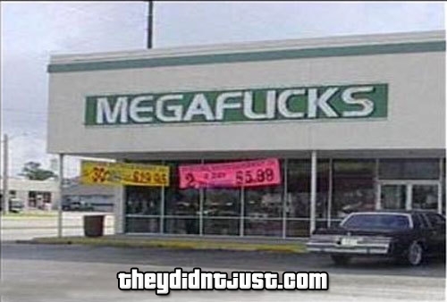
Megaflicks obviously doesn't give one with either it's use of caps or it's unfortunate side effect with the font used in it's logo (image found on www.theydidntjust.com).

And here... Is a Locum poster that abuses the cliche of replacing letters with graphics... To come up with something less than desirable (image found on www.boredpanda.com)


And now for the excellent examples of great typeface usage in logos! Here in Ed's Electric, the letter E serves as two functions, providing the company's brandname, and being the negative space that creates the electrical plugs.


Another example, Black Cat uses uniquely shaped "C"'s for the implied cat eyes.


Crowded letters serve as the title very well.


"impotence"'s letter "I" is left limp for a cheeky logo.


What's missing?

Sunday 6 November 2011

Lesson 11

"This requires you to match 6 typefaces to 6 shoes. This activity places emphasis on the "cultural influences" that determine how a typeface makes you feel.
The shoe's appearance suggests something about the character of the owner and this, in turn, should provide a clue to which typeface to match it with."

Lesson 10

"Find a typeface you like and represent it using sizes and styles in a manner similar to the Gill Sans panel above. Put your name in there somewhere."

 Grilled Cheese is one of my of my favourite typefaces due to the fact that it's a simple yet fairly solid in style, not much can be said about it apart from it being slightly frivolous but not to the point of being too "childish".

Saturday 5 November 2011

Learning Activity 8: Grid layout (2 hrs)

"Find 2 magazine layouts that adhere to a grid. Take a photo/ scan them. Indicate on each one where the grid is. Use a marker pen if necessary. Make sure you take a photo before you cover it with pen, you may need it later."
 "Find 2 magazine layouts that don't appear to follow a grid."
 "Find 2 examples from anywhere that adhere to a grid. Car signage, clothing, architecture. Your choice."