This assignment requires you to grab a digital camera and find 5 examples of what you feel is representative of good type use in logos, signage, print layouts, graffiti, car graphics, t-shirts etc. and 5 examples of what you feel is bad typeface use
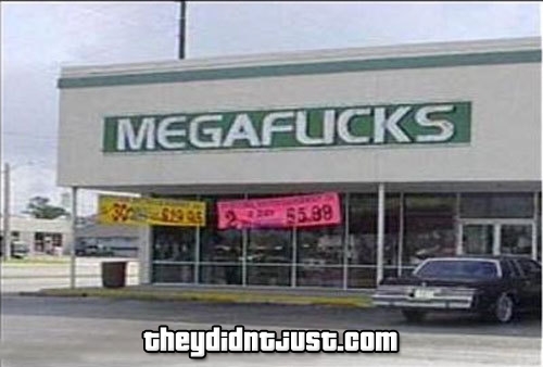
I'll start off with the bad typeface usage - In the first example you can instantly tell that the font used for the title, "Junior Jazz Dance Classes", is unfitting for an event that covers Cheerleading, Hip Hop and Jazz. Additionally, the two dancing figures are quite... Suggestive to the point where if one blurs his vision slightly, the two dancing figurines looks like something completely different...


And now for the excellent examples of great typeface usage in logos! Here in Ed's Electric, the letter E serves as two functions, providing the company's brandname, and being the negative space that creates the electrical plugs.

Another example, Black Cat uses uniquely shaped "C"'s for the implied cat eyes.

Crowded letters serve as the title very well.

"impotence"'s letter "I" is left limp for a cheeky logo.

What's missing?

No comments:
Post a Comment